Low signal-to-noise ratio
Important updates are buried in spam. Scrolling chat history to find what matters is exhausting and unreliable.
Context
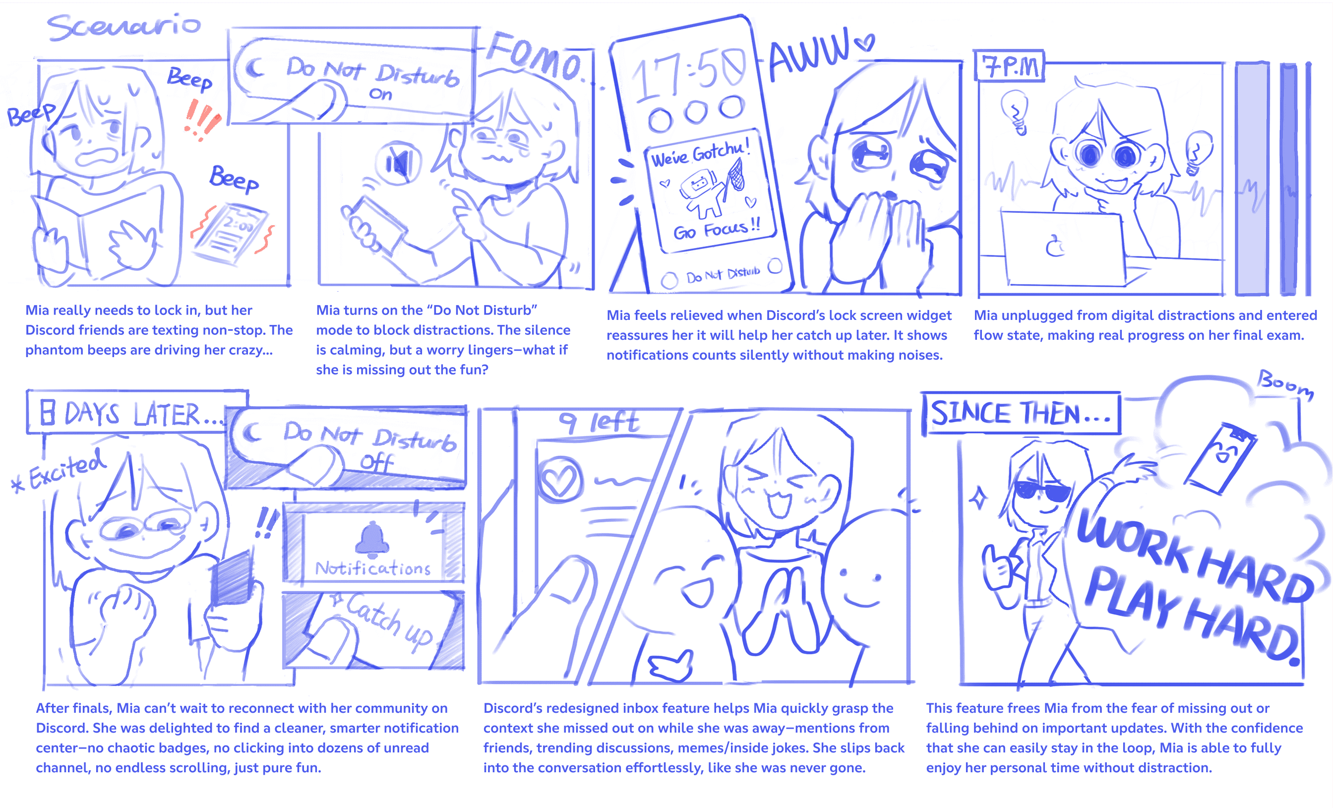
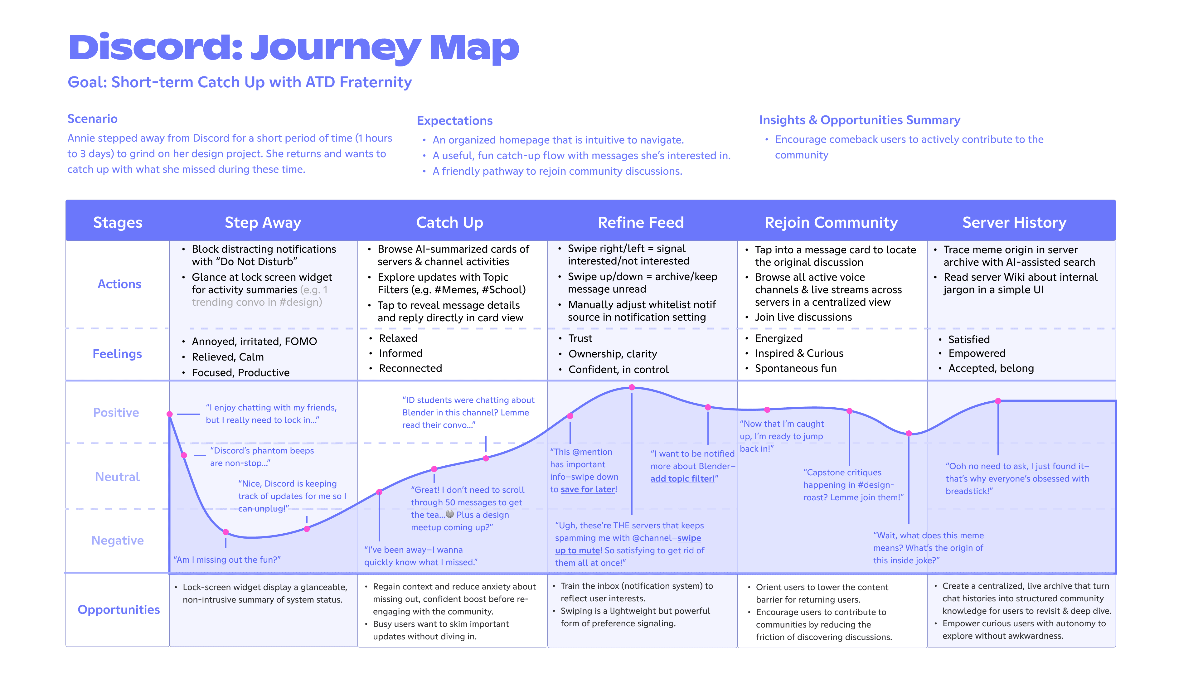
“Do Not Disturb” offers peace, but at a cost: the gradual erosion of belonging.
Re-entering a community can be overwhelming—missed inside jokes, lost context, and the quiet anxiety of FOMO: “Am I missing out on the fun?”
In active Discord communities, members struggle to stay informed. They either feel glued to their servers or return to irrelevant noise after time away.
Redesign vision
Discord has expanded beyond its gaming roots to support tutoring, networking, hobbies, and content-creator fan communities.
Its playful, beginner-friendly brand does not yet translate to its mobile experience, which can feel intimidating and overwhelming for newcomers with low technical fluency.
Steep onboarding, folder-based navigation, and unpredictable—or invisible—system behaviors can create friction and discourage prolonged participation. Our vision was to bring Discord's mobile UX in line with its welcoming rebrand.
See final designCustomer insights
Use Discord as a main information source for fundraisers, in-person meetups, and community updates.
Have mental models shaped by Instagram and Messenger—not advanced search, bots, threads, or server hierarchy.
Are busy rather than chronically online, and struggle to keep up with fast conversations and complex server structures.
Executive board members in this college design fraternity juggle weekly announcements, event coordination, fundraisers, and new-member recruitment and onboarding.
All while trying to keep up with spontaneous hangouts and the social energy that makes the community special.
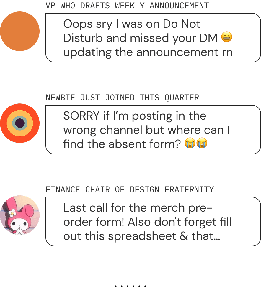
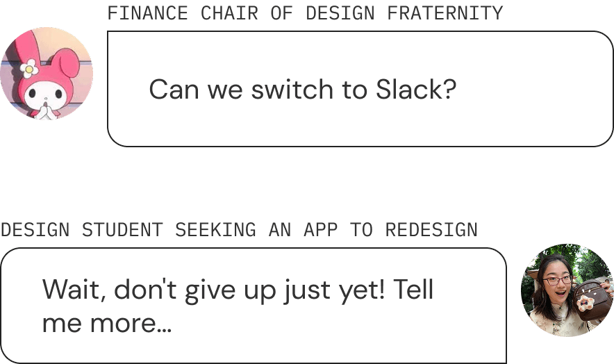
One board member finds herself craving the structure and clarity of Slack when it comes to managing a growing community.
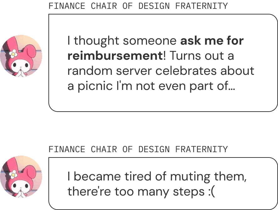
When she tries to focus on school work or enjoy personal downtime, her Discord beeps non-stop for @mentions from irrelevant servers.
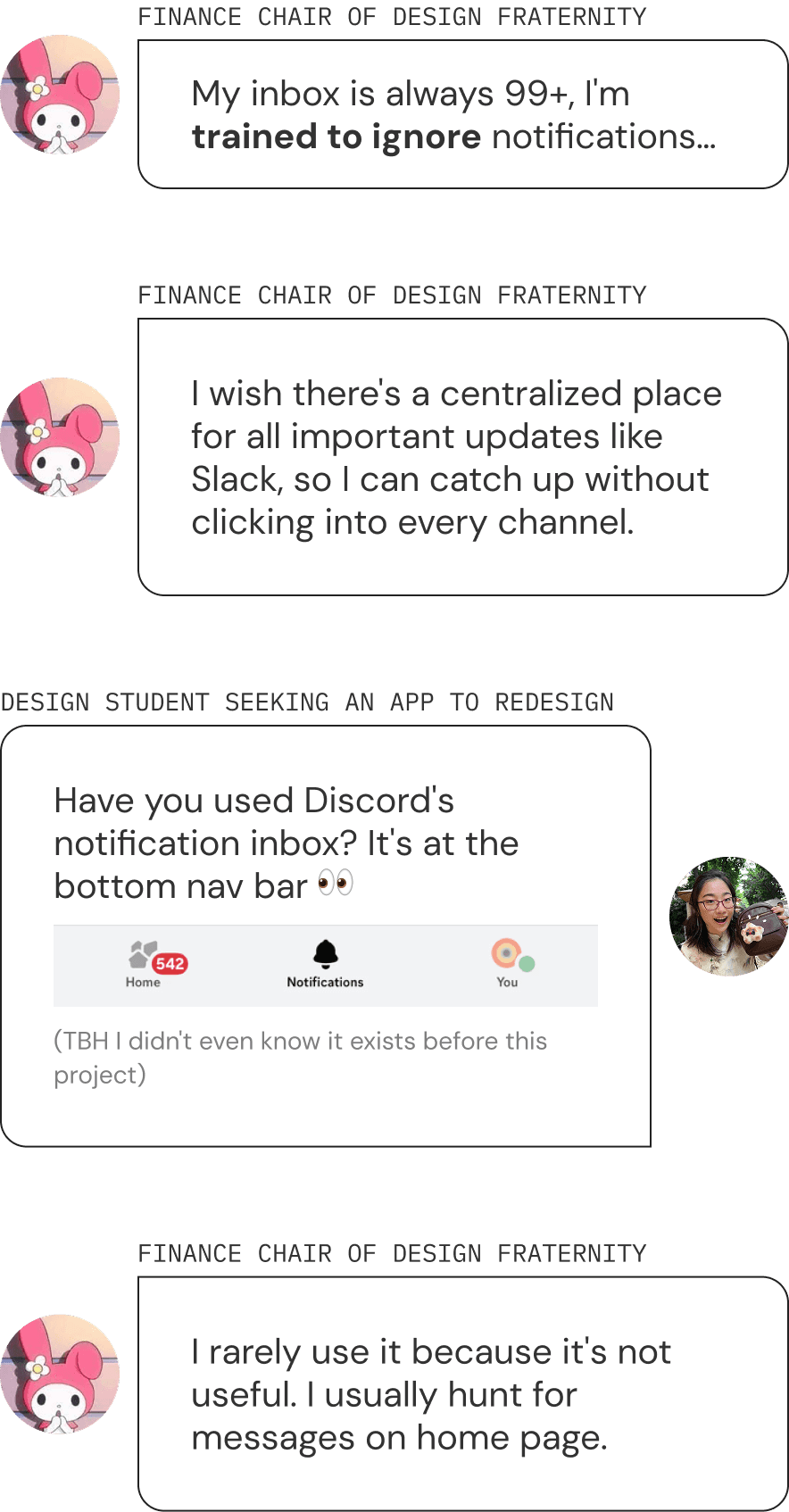
When she returns to Discord after being away, she faces an overwhelming flood of unfiltered messages and a cluttered home screen.
Opportunity
Secondary research
Important updates are buried in spam. Scrolling chat history to find what matters is exhausting and unreliable.
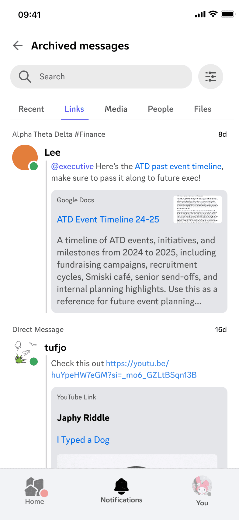
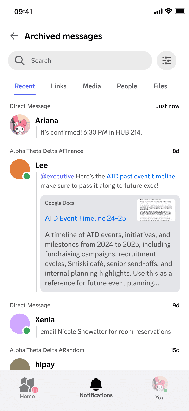
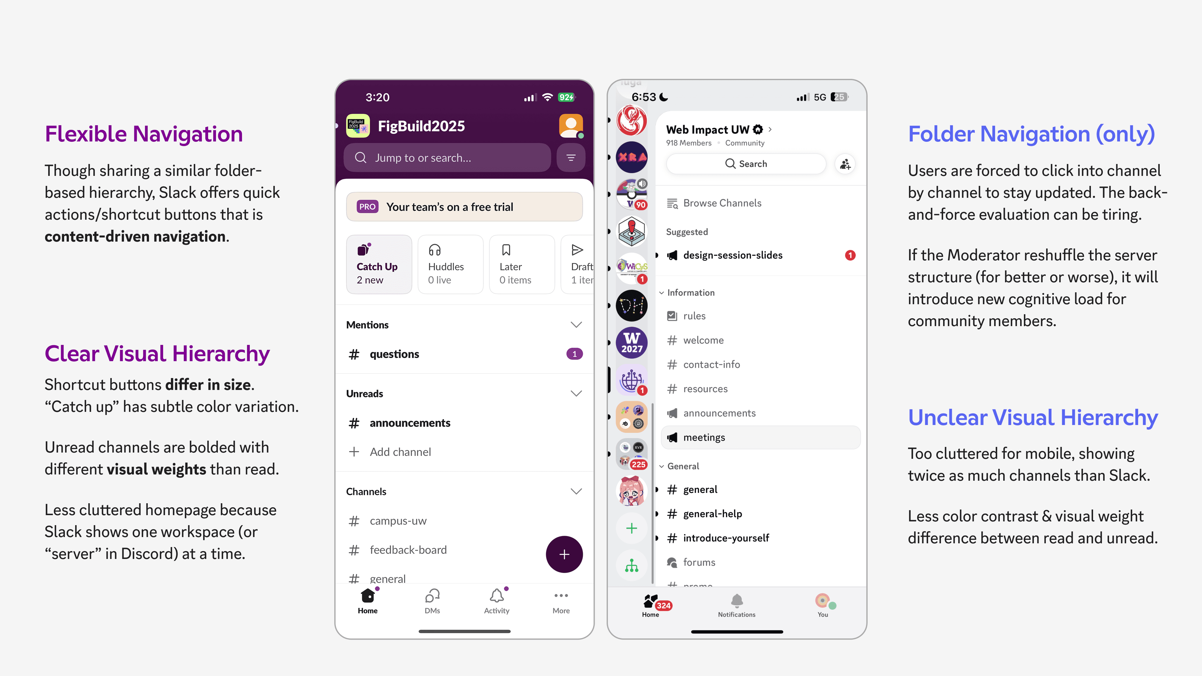
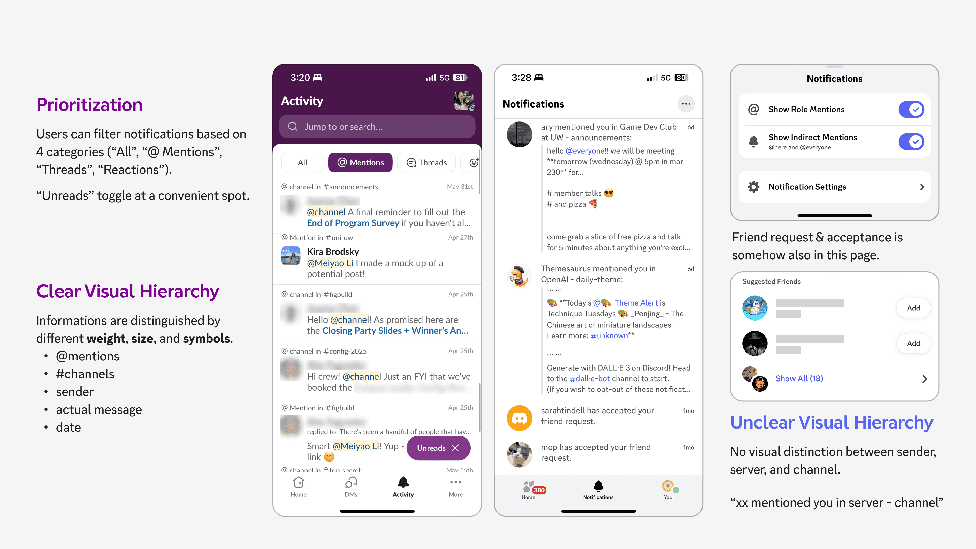
No clear visual cues for notification history, leaving users to search server by server for a source.
To regain control, users must mute entire servers. Interest- or keyword-based whitelisting is not available.
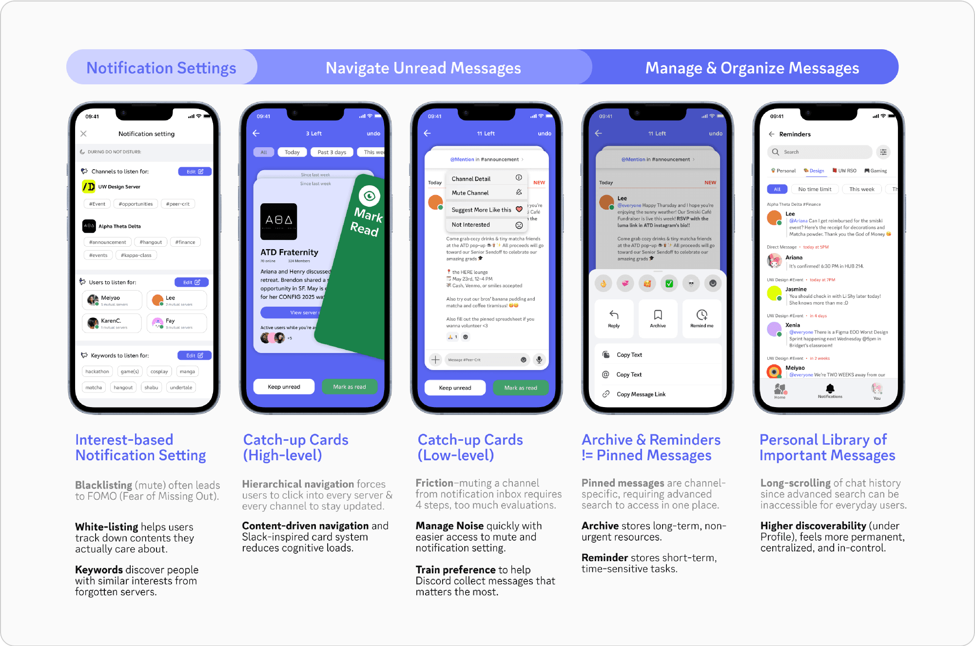
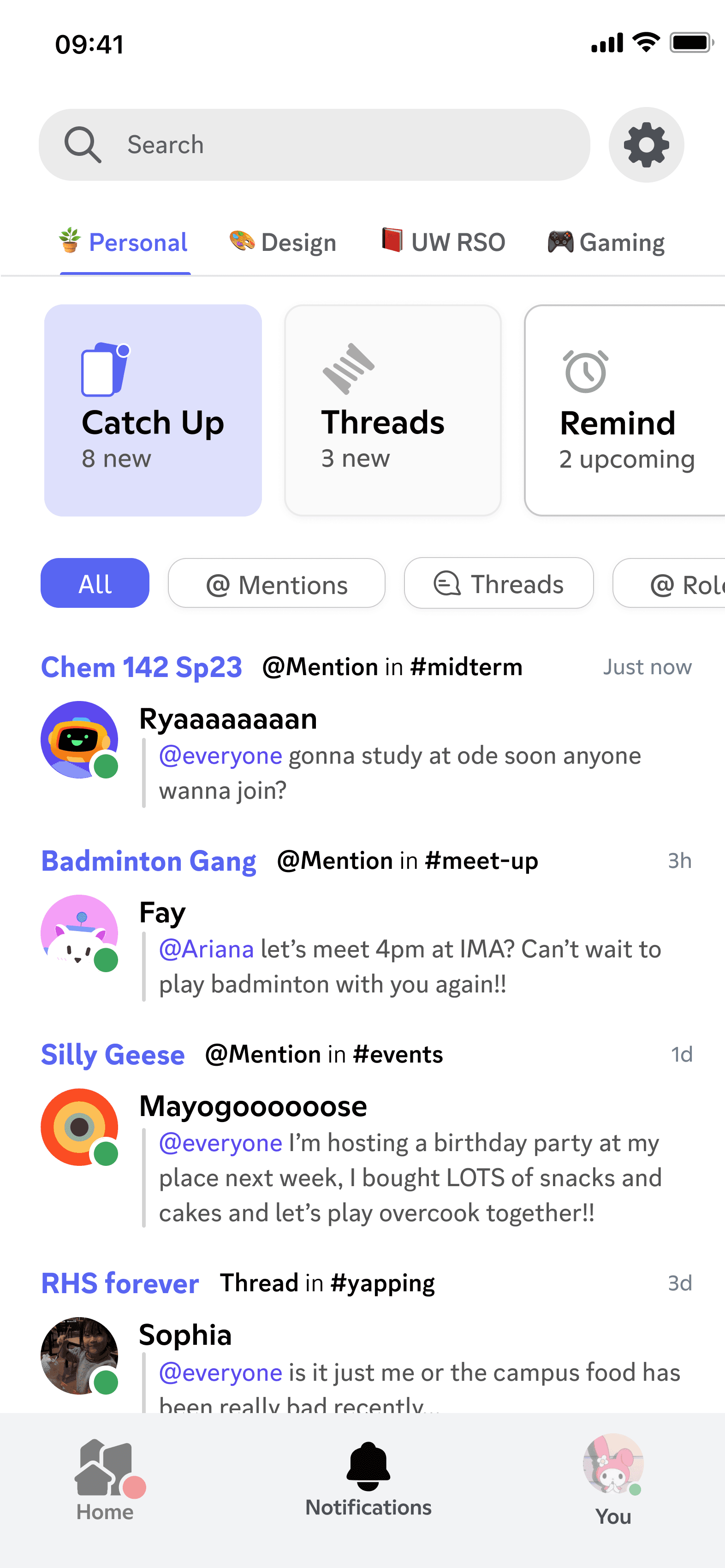
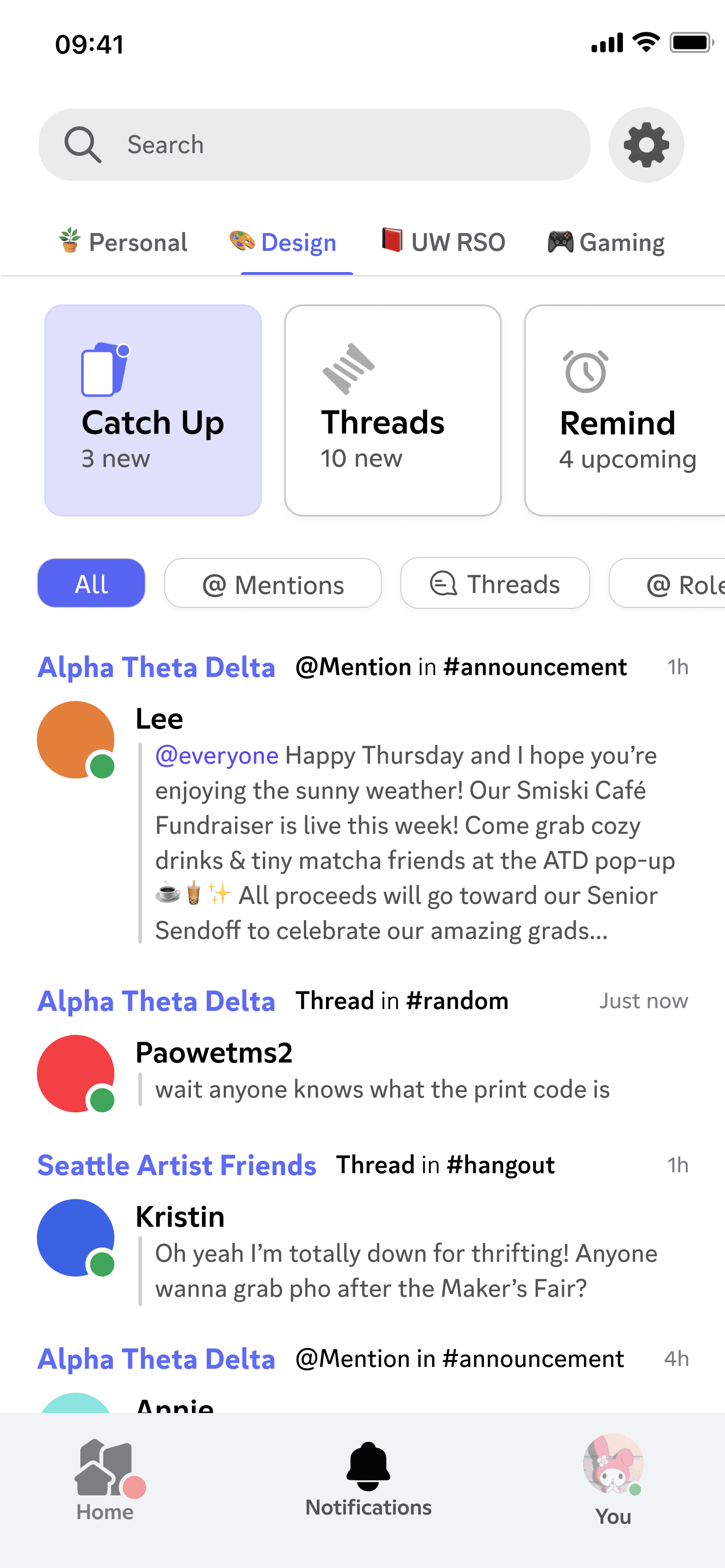
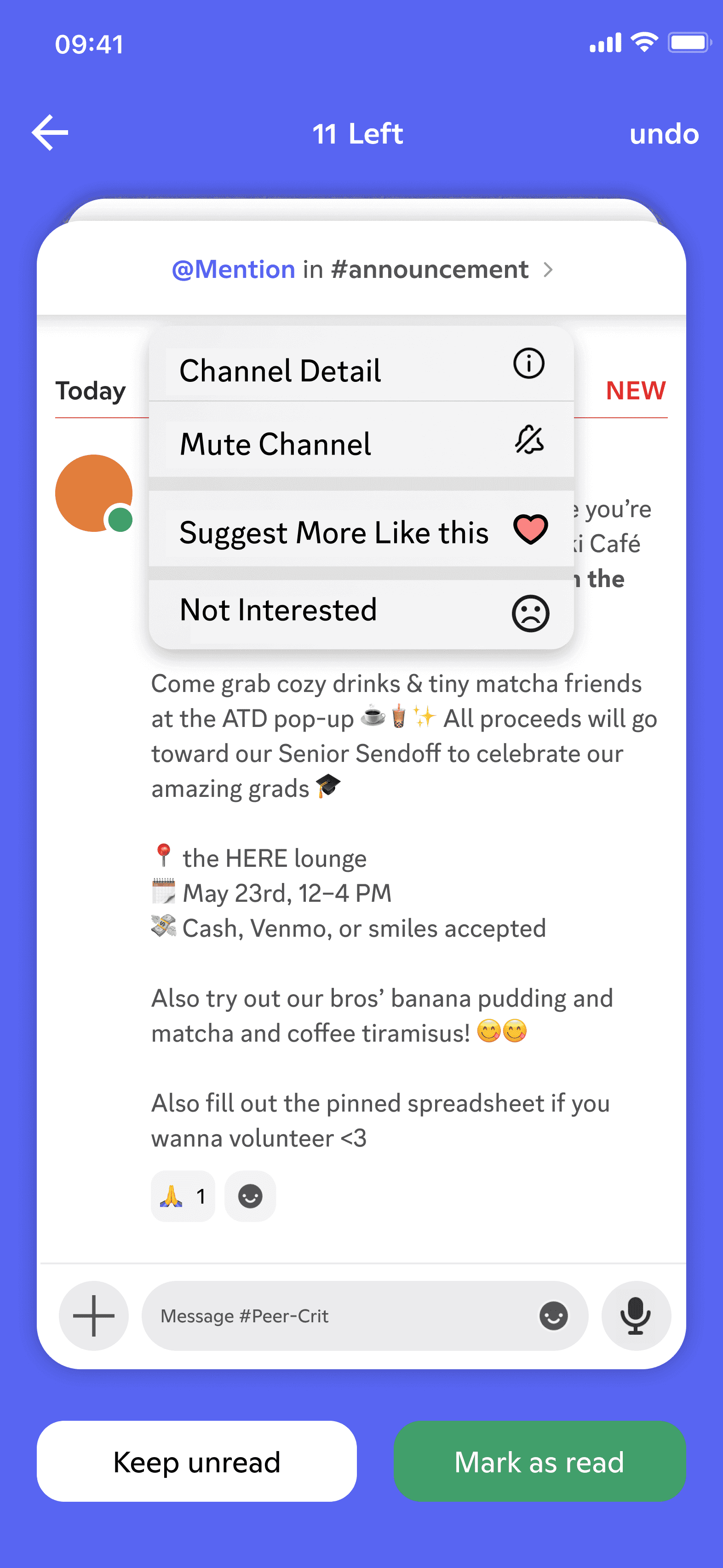
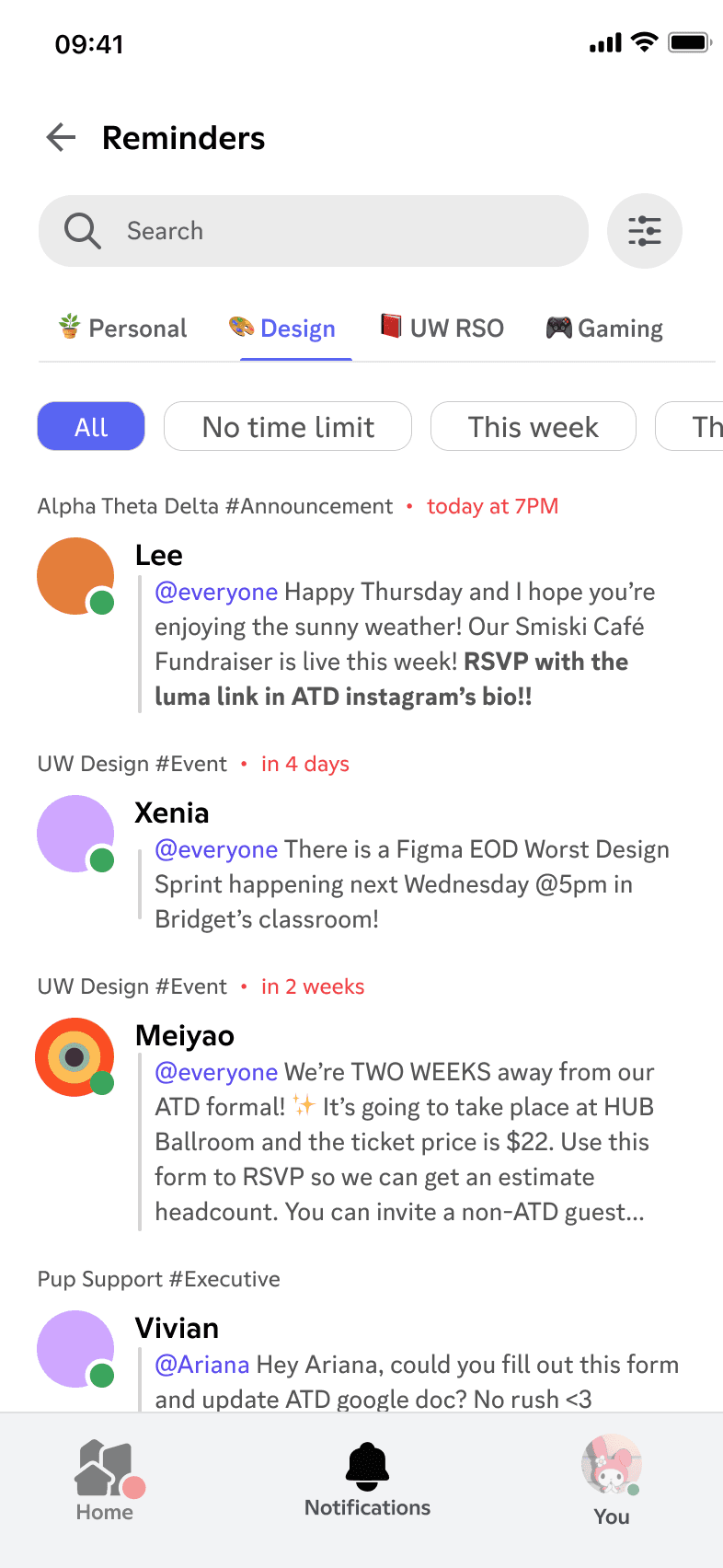
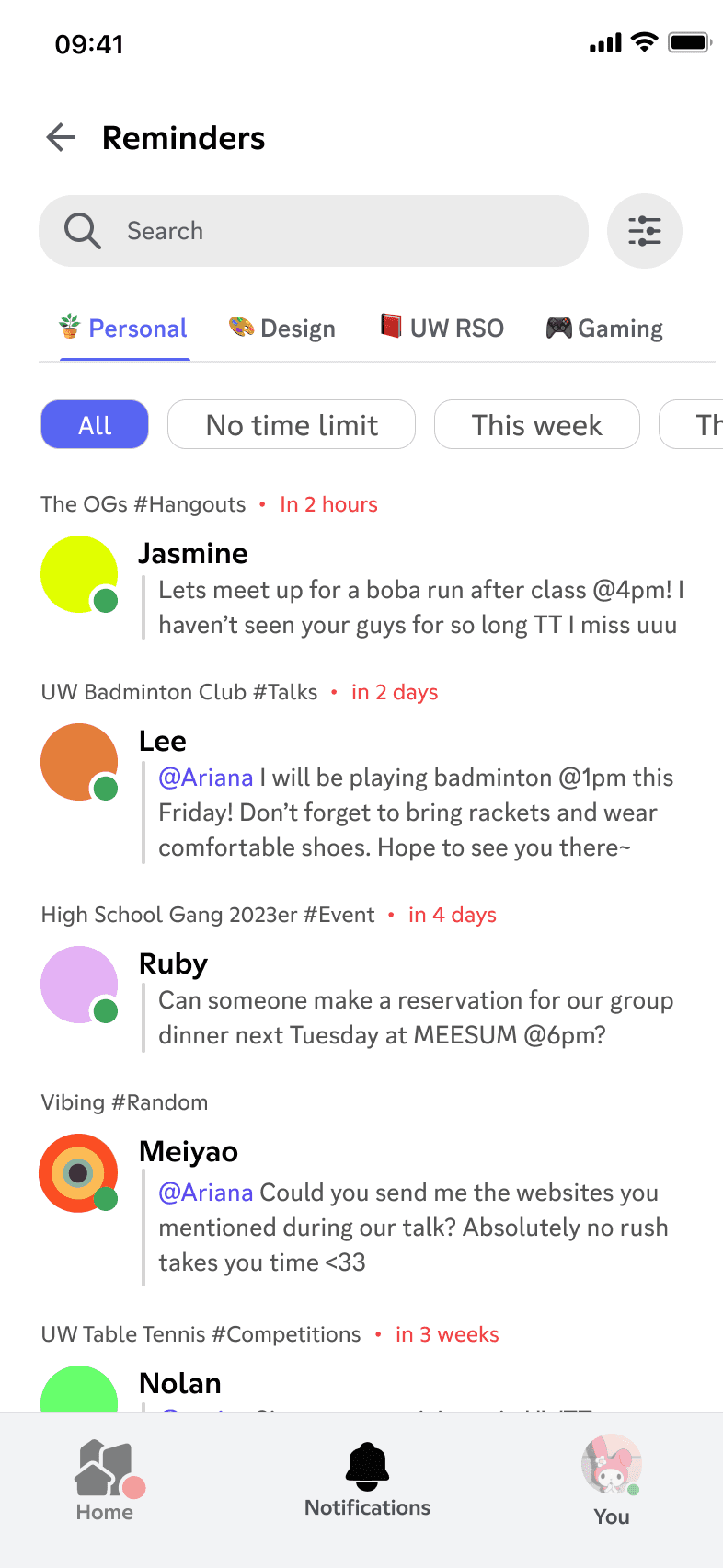
Slack provides a useful reference for a clearer mobile hierarchy and an alternative route to important updates. Its filtering tags, concise message sources, and two-line previews reduce information overload while keeping updates actionable.
Redesign goals
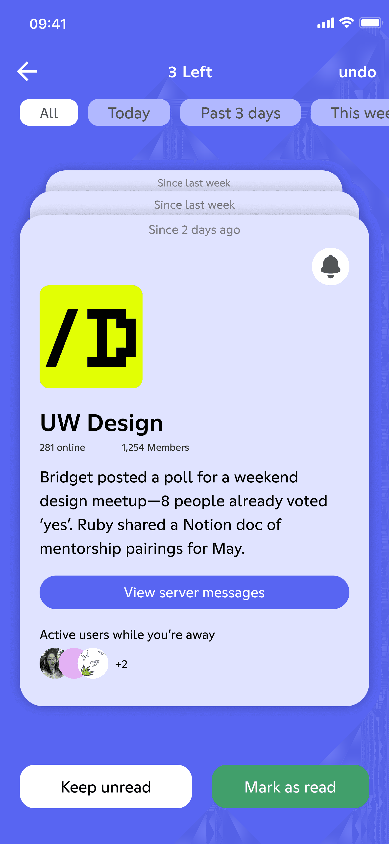
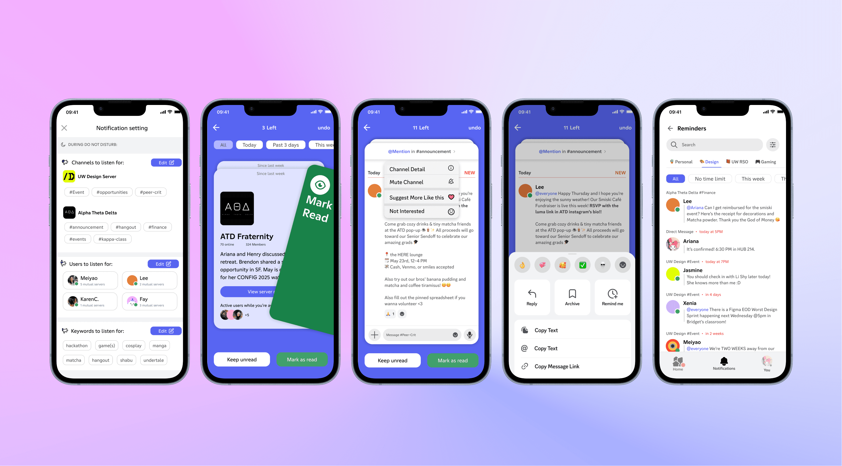
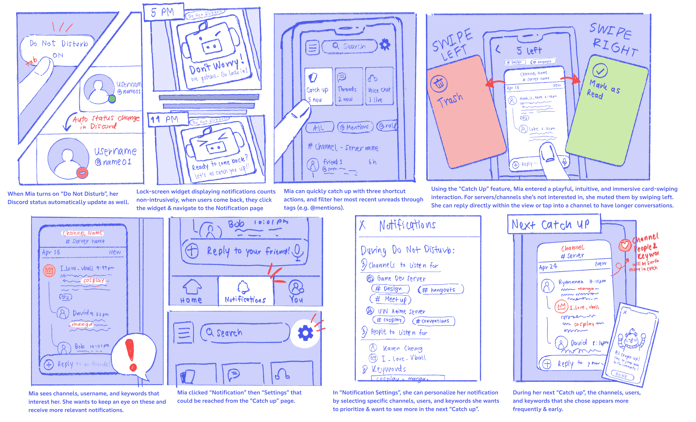
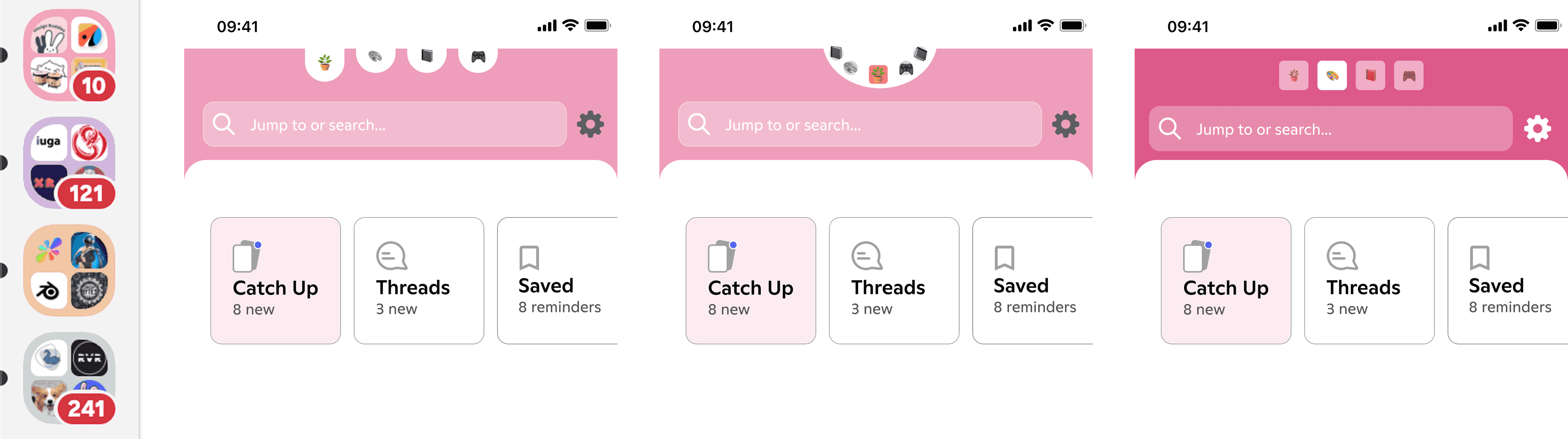
Bypass hierarchical, folder-based channel lists with a shortcut for quick catch-up.
Improve visual hierarchy to support Discord's multi-server scale and surface what matters.
Let people decide precisely what reaches their inbox with interest-based whitelisting.
Empathize
We used storyboards and a journey map to make the short- and long-term catch-up experience tangible, then used those artifacts to discuss edge cases before building the prototype.

Iterations
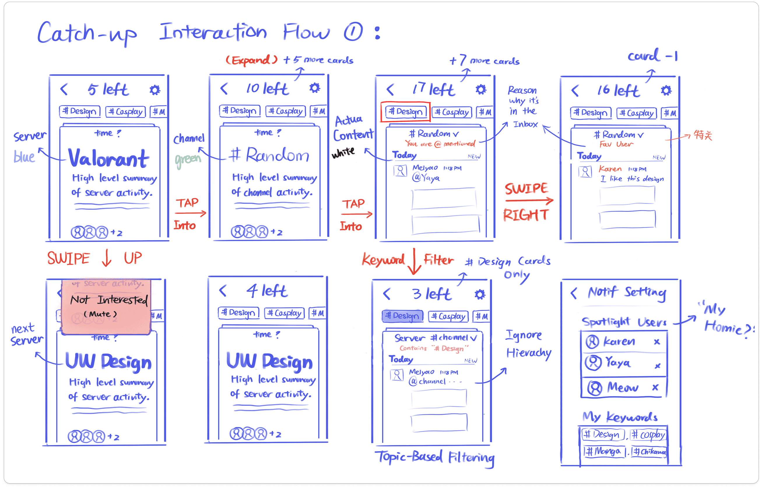
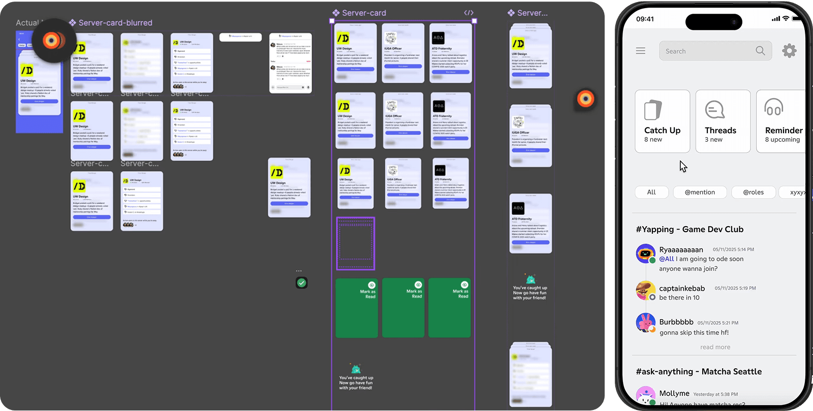
Copying Slack's card logic directly would overlook Discord's multi-server complexity. I sketched changing states and edge cases to get productive critiques before implementing them in Figma.
An early direction used blur and a parchment-paper effect. While visually expressive, it added distraction—especially when someone might need to move through more than 100 messages.
Usability testing
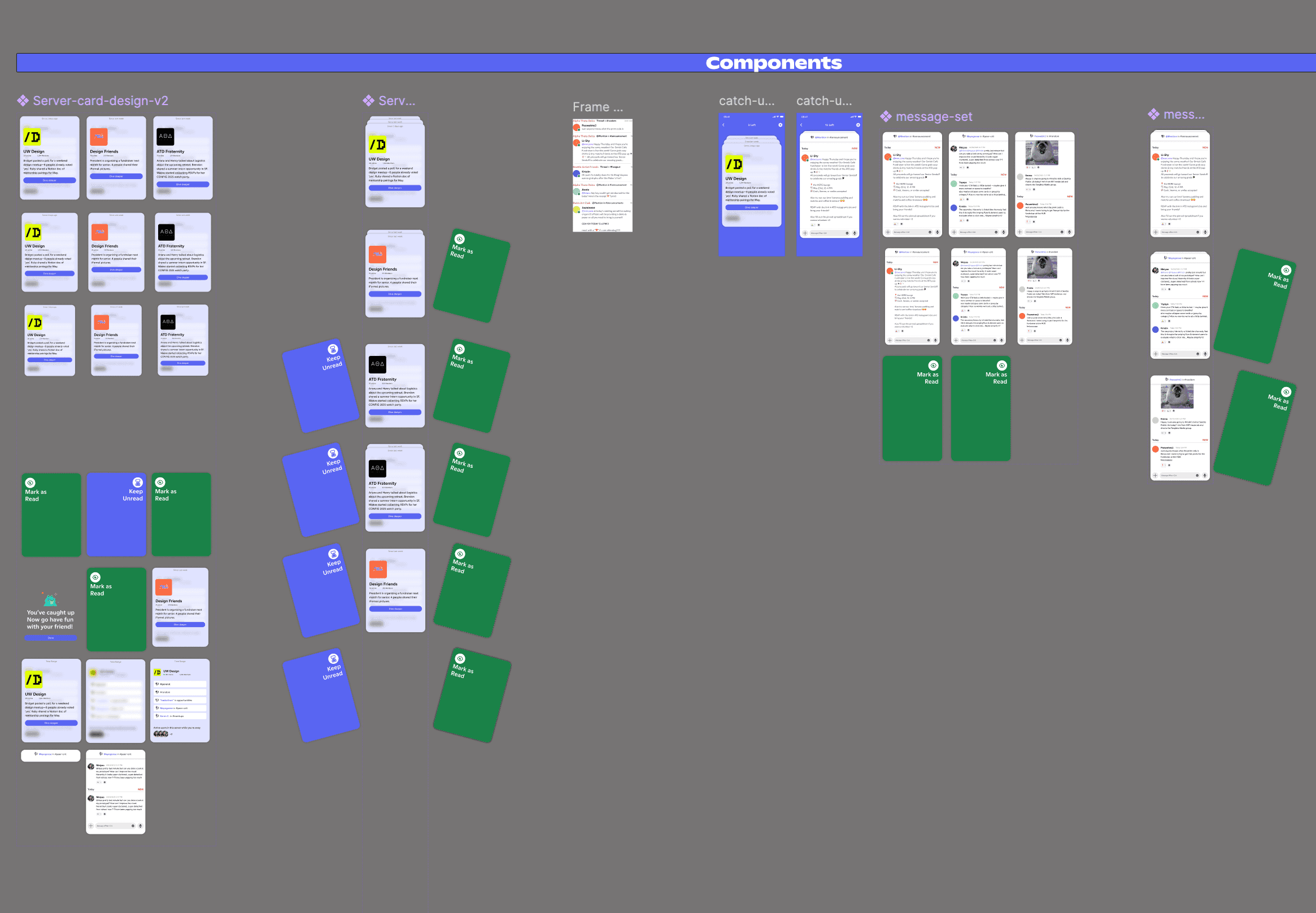
Testing revealed a real tension. People with a handful of servers wanted a dedicated catch-up view for each one; people in 60+ servers found constant server-switching impractical.
Rather than imposing Slack's workspace model, we noticed that people already group and color-code their Discord servers. We used that familiar, user-defined category as the middle ground.
Final design